The Invest Lab
Any single screen mostly produces noise. The names that clear two independent screens on the same morning are the shortlist worth reading.
- Role
- Sole builder
- Stack
- Python, Pandas, scheduled ETL
- Status
- Live, refreshes daily
The question
The liquid US market runs to roughly 2,500 stocks, and there is no shortage of tools that will screen them for you. The trouble is that most single rankings are noise, or rank everything on one generic metric. A momentum screen will hand you a stock that gapped on a single press release; a value screen will hand you a company that is cheap because it deserves to be.
So the question I wanted to answer was this: if several unrelated ways of looking at the market independently point at the same company at the same time, is that flag worth paying attention to? Answering it meant building the screens themselves, along with the pipeline that feeds and displays them.
The approach
Every weekday morning an automated pipeline pulls price and volume history, SEC Form 4 insider filings, ETF holdings, and news mentions, cleans and normalizes them into one common shape, then scores every ticker through five separate models:
- Movers and Shakers — scans the full liquid market for tradeable daily rhythms, scoring consistency of range rather than raw percentage moves.
- The Marathon — a long-term view that pairs ETF consensus picks with beaten-down quality names, benchmarked against the S&P 500.
- Insider Buying — parses SEC Form 4 open-market purchases to surface cluster buys and C-suite activity.
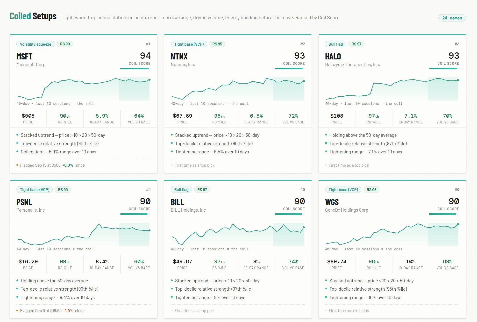
- Pattern Scanner — a daily S&P 500 scan for bull flags, volatility contractions, and moving-average crossovers, graded into conviction categories.
- The Analyst — the cross-reference layer: a daily deep dive on the top names the other four boards surfaced, with fundamentals, free cash flow, and filings attached.
One design rule held throughout: every result has to explain itself. Each score traces back to the specific inputs that produced it, so every board shows its reasoning rather than just a rank.
Market Metrics
Alongside the boards, two panels read the market itself rather than any single stock.
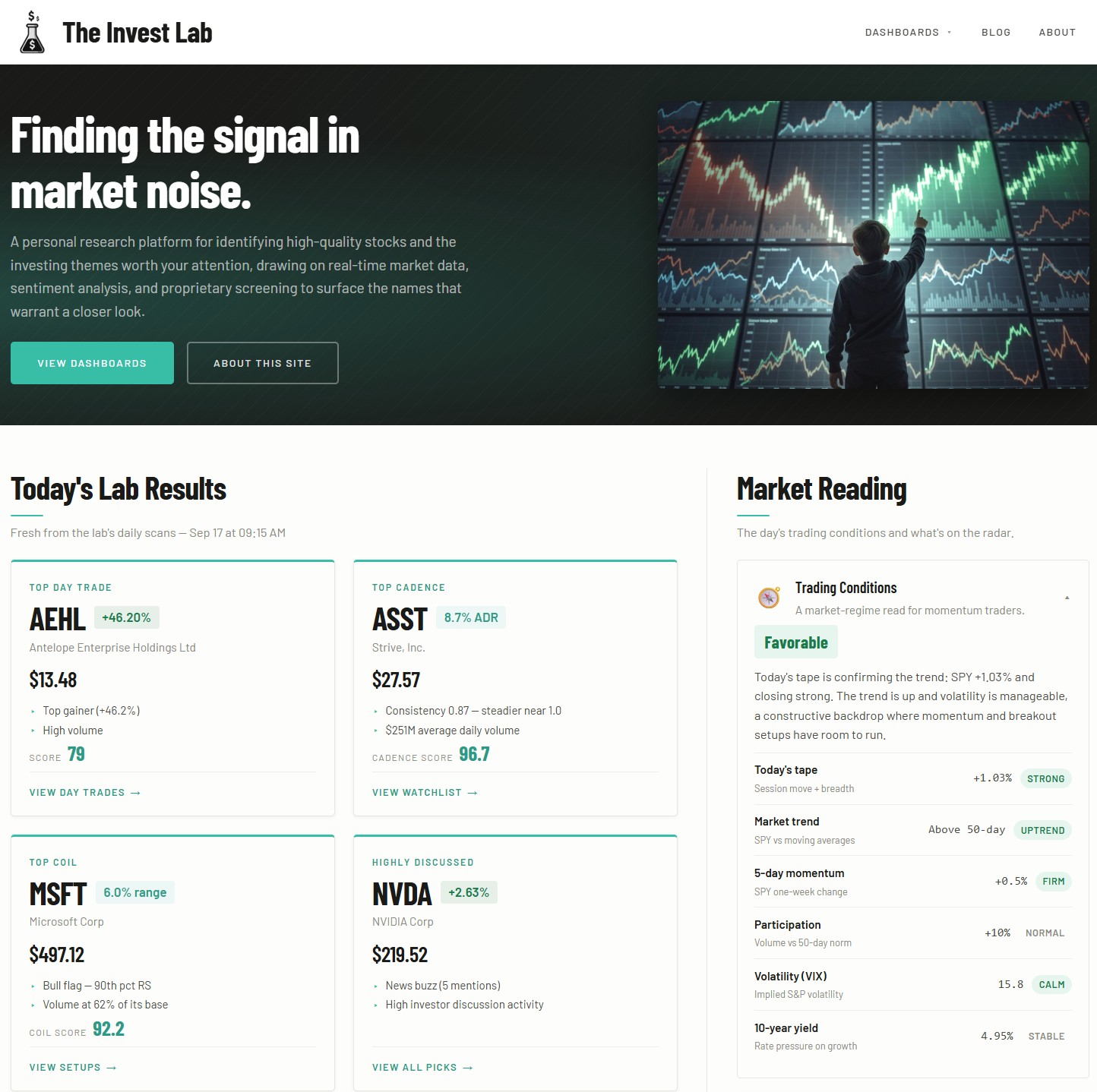
Trading Conditions is a market-regime read for momentum traders. It combines six daily measures — the session’s move and breadth, SPY against its moving averages, one-week momentum, volume against its 50-day norm, the VIX, and the 10-year yield — into a single label such as Favorable, with a plain-English sentence explaining why. It answers one question: is this a tape where momentum and breakout setups have room to run, or one where they don’t?
Macro Temperature is a proprietary gauge built from ten signals grouped into four weighted themes: Trend & Participation (40%), Risk Appetite (25%), Sentiment (20%), and Credit & Rates (15%). Each signal shows its own reading and a hot-to-cool rating, and two are deliberately inverted — credit spreads, where tight means complacency, and insider breadth, because executives buy weakness and go quiet into strength. It updates on weekday mornings and, like everything else on the site, shows every input behind its number.
What it turned into
The cross-reference turned out to be the part that matters. A name on a single board can usually be explained by one ordinary event. Names on two or more, such as an insider cluster buy that also shows a tightening base, are rarer, and those are the ones the daily deep dive is spent on. That narrowing, from roughly 2,500 tickers to a readable handful with the reasoning attached, is the whole product.
Building it was as much a data engineering exercise as an analytical one: reconciling sources that disagree about tickers, handling the days a feed simply doesn’t return, and keeping a scheduled job reliable enough that the site is correct at 6 AM without me touching it.
Testing my own model
The Insider Buying board started with a conviction score built on informed judgement. It weighted cluster size most heavily, on the logic that several insiders buying together is a stronger signal than one, and gave the stock’s recent price action no weight at all. Then I measured it, and it was wrong.
The backtest reconstructs 22,600 historical insider-buying clusters from five years of SEC Form 4 filings. Each one is scored using only what was knowable on the day, and its return over the next 60 days is compared against a size-matched benchmark. Entry is the day the filing became public, never the day of the trade, because you can’t act on a form you can’t see yet.
The result was uncomfortable. The model had been ranking names close to backwards: clusters it scored 70 to 84 trailed the index by 2.84% at a 39.9% win rate, worse than the clusters it scored under 40. Price context, the dimension I had ignored, was the only one that separated outcomes consistently. Cluster size, the one I had trusted most, turned out to be a confound: large clusters looked like a bad sign only because they concentrate in distressed companies, and once price is held constant the penalty disappears.
So I rebuilt the model around the evidence and cut the dimensions that didn’t hold up. The methodology panel on the live dashboard says all of this publicly, including that the effects are modest and drawn from a single market regime. It’s the result on this site I’m most willing to be judged on.
What I'd improve next
The site already keeps score. Every top pick is logged with its 30-day outcome, day-trade picks are also graded at the same day’s close, the next day, and five sessions out, and the homepage publishes the record with the misses left in. The next step is breaking that record out by board, so it shows not just whether the picks work, but which of the five boards has earned the most trust.
In Closing
The Invest Lab began as a handful of Python scripts for screening and backtesting ideas I wanted to check for myself. It grew one board at a time, each added because a question came up that the existing screens couldn’t answer, and the cross-reference layer came last, once there were enough independent views to compare.
What started as a personal tool is now a scheduled platform that publishes every weekday morning, with a macro gauge and a research blog alongside the boards. It is still evolving, and the improvements above are next on the list.
The Invest Lab is a personal research and educational project. Nothing on it is investment advice, and the scoring engines are algorithmic reads of price and fundamental data that can and do misjudge.